Concept and screen design
of an online shop for displays and large format print products
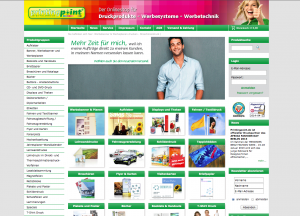
Due to the relaunch we analized the current shop and focused on a clean, informative and better selling design.
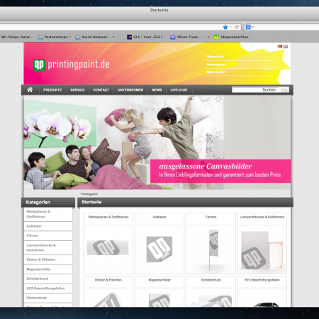
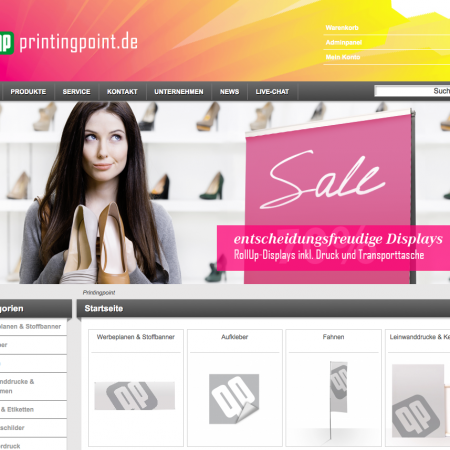
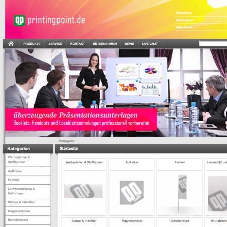
The design of the new printingpoint-shop was supposed to more structured. In the same time we wanted to emotionalise the brand by bringing people more into the focus and put our products as a part of their everyday life. In the examples below we used stockphotos and photoshopped our products into the scenery. Such as a rollup-display in a shoe-boutique, a canvas into a bedroom or a simple prints on a presentation board.
The banner shows a a slideshow of the different products and sceneries, which fade every 6 seconds and allows the user to reach the dashboard of each shown product within a click. Our goal to realize a 2-clickbuy is already there achieved!
In order to increase sales we analized the current shop and decided to make these modifications:
– level up the structure of the categories > 2Click-buy!
– use bigger, more detailed pictures of the items
– implement payment tools such as visa, paypal, invoice-buy
The product dashboard
one click away from the top page, the visitor enters the product dashboard.
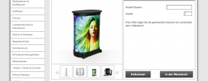
There he can see a lot of detailed pictures, read every important detail about size, weight, print-specification etc.
On the right side there is the online calculator that allows to see the price of the item and put it right into the cart.
Beyond the dashboard there you can find further recommended products.
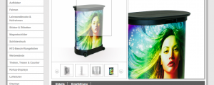
The zoom-option
buyers want exactly know what they are going to buy. It is a matter of trust. The bigger and more picture of the items, the more trust we gain from our visitors. By mousovering the picture you see big and clean details right at the side.
