Concept and screen design
homepage – la maison des frites – burger restaurant
Home:
At first impact we want visitors to know the core conpetence of our customer within a message. Our customer uses only fresh ingredients from the region Hessen – Germany. So we decided to use no stockphotos, instead I shot all pictures at the restaurant. The core message is: Here you get the taste of your region on the belgian way.
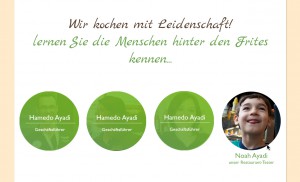
People
Especially in the gastronomy it is very important for customers to know who works behind the counter. Giving the possibility to have a closer glance at the team makes guests feel more comfortable and gives them the feeling of transparence and familiarity.
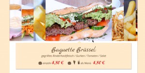
Products
the products build the core conpetence and are supposed to be shown as much detailed as possible. That requires as the list of the ingredients as the price-tag. Instead of empty phrases we use original pictures of the products, they speak for themselves.


